
Worker safety| Proximity detection system| Mining and Coal industry
Introduction
This interactive training immerses new hires in the mining and coal industry with essential safety protocols, blending engaging visuals with hands-on learning activities to build real-world readiness and awareness!
Responsibilities: Instructional Design, eLearning Development
Target audience: New employees in the Mining and Coal Industry, onboarding training
Tools Used: Articulate Storyline, Adobe Illustrator, ChatGPT
Year: 2025
Overview
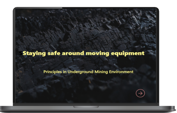
Designed for new employees in the mining and coal industries, this course blends real-world hazard training with immersive interactivity, preparing learners to navigate environments where mobile equipment and human activity intersect safely.
With no direct access to internal mining data or proprietary safety protocols, I created this experience based on publicly available materials and insights from Sandvik’s digital safety systems, reimagining them into a training model that feels intuitive, practical, and human-centered.
Project Goals
- Train workers to interpret proximity alert systems and respond correctly
- Build understanding of safety zones (safe, caution, danger) around moving machinery
- Guide workers in using their safety equipment — including cap lamps and distress systems — to protect themselves and others
- Reinforce Endsley’s Situational Awareness model: perception, comprehension, projection
- Familiarize learners with how safety data is tracked via mining dashboards and what it means for them in real time
Instructional Design Strategy
Research and Constraints: Without internal documentation, I sourced information from public Sandvik demos, safety whitepapers, and mining tech sites. I pieced together realistic emergency workflows, proximity detection logic, and safety interaction patterns to form the course structure.
Tone and Visual Designs: I wanted learners to feel informed but not overwhelmed. Visuals are custom-tailored for each step, including blinking alerts, helmet signals, and layered dashboards. I aimed to create intuitive scenes where learners don’t get lost, but are drawn to explore.
Key features
✅ xAPI Tracked Interactions: Learner behavior is tracked via xAPI, offering rich insights into who clicked what, where, and why — ready for integration into Learning Record Stores.
✅ JavaScript Animation: Micro-interactions — like character eye blinks — were custom-built to create a lifelike experience.
✅ Scenario-Based Branching: Branching conversations with realistic character decisions push learners to apply procedures, not just memorize them.
✅ System Realism: Realistic UI panels show how alerts are acknowledged, reset, or tracked — from helmet lamps to full dashboards.
✅ Click-to-Reveal & Delayed Layers: Learners must explore each part of a system before proceeding, building structured discovery into the design.
Design process
- I created original illustrations for proximity alerts, helmet feedback, dashboards, and tunnel maps
- Each image was designed with functional clarity — color-coded zones, blinking lamps, and intuitive interfaces
- Visual storytelling was used to reduce cognitive load while reinforcing procedures (e.g., red zones, alert chains, distress flow)
Reflection
“This project stretched every skill I had — from visual UX to instructional logic. It taught me how to design not just a course, but a feeling: urgency, clarity, and calm in moments that count.”
My biggest win? Creating moments that feel emotionally human, even when they’re digitally simulated
I built every asset myself, including illustrations, voice direction, UI mockups, and logic flows
I became more fluent in xAPI and variables within Articulate Storyline
I learned how to design for unknowns — working without insider access, and still making it feel real